Information
New London, Connecticut has a rich history, largely focused on its role as a superb deep-water harbor. It was a center of activity for the Mohegan and Pequot people for thousands of years prior to English settlement in 1646.
The city became a trading hub for commerce with the West Indies. And a large and highly profitable industry grew up around the exploitation of seals and whales.
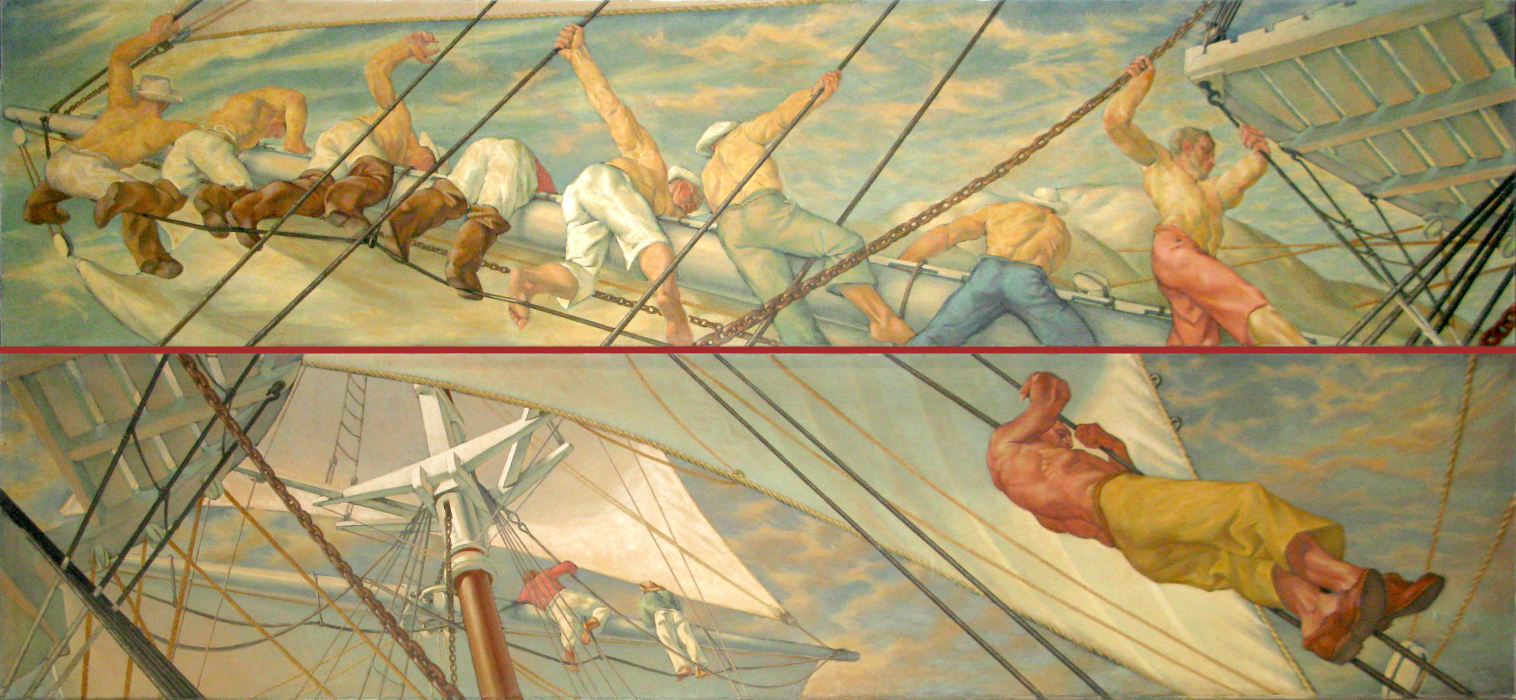
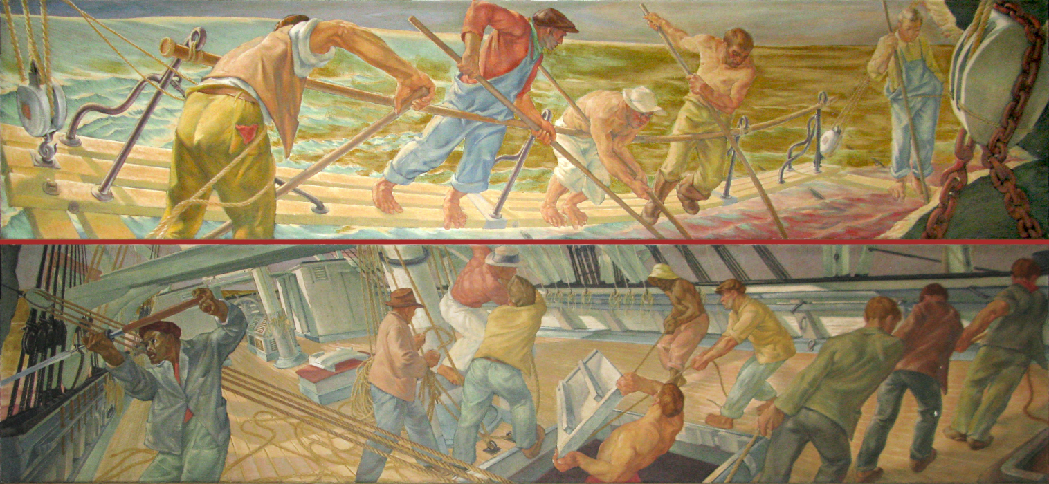
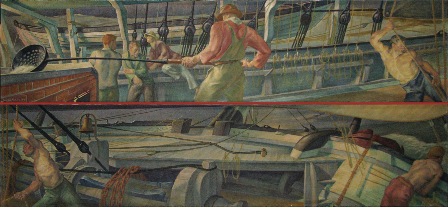
It is therefore not surprising that Thomas Lafarge chose whaling as his theme for the series of murals that he painted for the New London Post Office. The Post Office Building provides a vast space for this work, which is arranged in pairs of panels along three walls of the building's large lobby.
A description of these murals was given in the nomination for this Post Office for a place on the National Register of Historic Places:
Murals painted in 1933 and installed in 1938 depict scenes typical of early whaling, and are integrated well into the lobby design. The murals were commissioned as part of the Public Works of Art Program and painted by Thomas Sergeant Lafarge of New York, an important local artist during that period of time. The six lobby murals, grouped into three units "Aloft", "Cutting In", and "Morning Watch Sunrise" were installed in 1938 and are in very good condition. After careful investigation of all existing post office murals in Connecticut, a leading art historian has judged this series of murals as the finest in the State. Wrapping the walls of the lobby, they produce an illusion of being on the deck of a ship, an illusion highlighted by the artist's superb techniques of perspective and powerful foreshortening employed to illustrate ship's rigging and lines.
Each pair of murals is displayed horizontally. For the convenience of online display, we have presented each pair one above the other, with the mural displayed left-most in the Post Office being shown on top of the mural displayed right-most in the Post Office.
All of the Post Office Murals present problems in terms of their faithful display and representation. They often suffer from aging and deterioration of their materials and from accumulated dirt and grime. Lighting may be inadequate to bring out details in the artwork, and stray light from skylights and windows often casts shadows across the work.
On this Web site we are trying to give viewers some idea of how the murals might have looked in their prime and under optimal display and lighting conditions. This involves a certain amount of digital processing of the photographs, which will no doubt offend purists and experts who will recognize where we've failed to display an accurate rendering of the original artwork. But it may make the work more accessible to people who might otherwise pass it by without notice, including people who have noticed, but not really seen, the murals as they are currently displayed.
These issues are particularly germane for the New London murals. Their scope and brilliance have led one art expert, Dr. Philip Eliasoph, to describe this Post Office as the "Sistine Chapel of Connecticut." I hope we are celebrating Lafarge's achievements and not debasing them in the way the images are displayed on this Web site.
The digital transformations made to display the photographs are of two types:
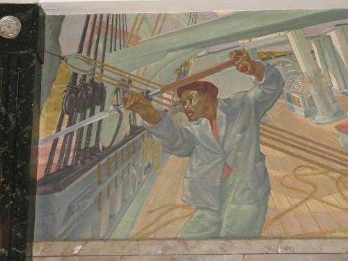
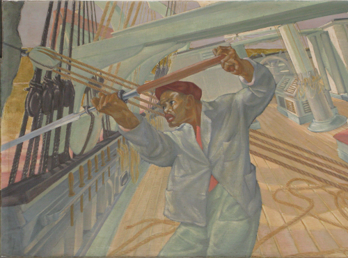
- First, adjustments are made to correct for the perspective of the camera taking the photographs. In the absence of reliable information on the size of the murals and indications of true verticals and horizontals in the paintings, these adjustments are approximate, and some distortions inevitably remain.
-
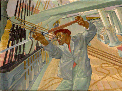
Second, where the colors of the mural are faded, poorly lit or obscured by dirt, there is an effort to "punch up" the colors a bit and try to restore the clarity of the original artwork. This, too, is necessarily an approximate and unreliable task, for which I'll have to accept full responsibility.
- Digital processing is done with the fantastic open-source program, The GIMP.
- A "quick and dirty" approach to brightening the pictures is to create a duplicate layer in the digital image and use a "screen" transformation -- a mathematical process that effectively lightens and brightens a photographic image. A click on any of the pictures displayed on this site will show "Camera Settings" that will include the phrase "Simulated Flash" where this process has been employed. The phrase "Simulated Bright Flash" means that the screen transformation has been applied twice, although this process usually washes out the image too much for an appealing display.
- A more time-consuming approach is to adjust the color levels of the image in GIMP. For the New London murals we have attempted a more-or-less mechanical approach in an effort to provide some uniformity across the many images displayed. For each picture the brightness range is extended, with the blackest blacks and whitest whites being converted to pure black and pure white and the intensities of the remaining colors being pumped up -- made blacker or whiter, depending on where on the brightness spectrum they lie. The dividing points are chosen to affect as little of the image as possible. Typically, a hazy-looking grayed-out image will have no really black blacks and no really white whites, so there is little loss of information in this process. The visual effects, however, can be quite striking. Adjustments in color levels are noted in the Camera Settings popup with a set of three numbers. The first shows the cutoff for blacks (with 0 being pure black), the third the cutoff for whites (with 255 being pure white), and the second number is a "gamma" factor. A gamma value larger than 1.00 indicates some lightening of the image, and a gamma value smaller than 1.00 indicates some darkening of the image.
To illustrate these steps we show three versions of the same detail photograph. The first is a raw image, as it appears in the camera. The perspective distortions are particularly evident at this stage. A version with some perspective correction is shown next. And, finally, we show a color-corrected (or color-altered) version.
